
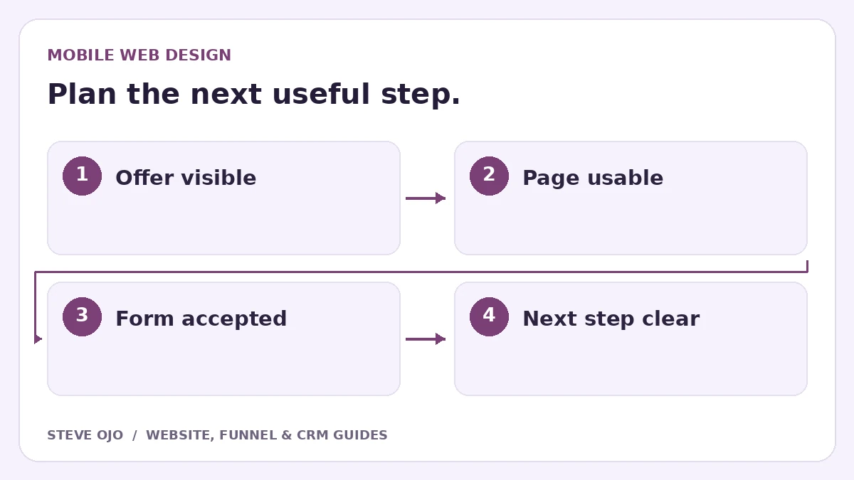
A mobile landing page should explain the offer, show a useful next action and let someone complete it without fighting the layout. A desktop preview cannot establish that. Test on an actual phone with realistic content, keyboard interaction and a slower connection before treating the page as ready for customers.
Keep the offer and next step easy to understand
At the top, state the service, who it is for and the action the visitor can take. Avoid shrinking a dense desktop headline until it technically fits. Rewrite it into a readable statement and keep important context near the button.
Do not remove essential service details, scope limits or useful links just to shorten the mobile page. Google’s mobile-first guidance calls for equivalent important content. A phone visitor needs the information required to make the same decision as a desktop visitor.
Load the important visual without blocking the page
Use appropriately sized images with dimensions set so the layout can reserve their space. Keep decorative animation from delaying access to the offer. Load lower-page media only when needed, while avoiding lazy loading for an image that is the page’s largest initial content.
Check the actual loading experience, not only a screenshot after everything is complete. An oversized hero video or a late-loading font can make an attractive design frustrating to use. Review performance with the people responsible for the build before adding more effects.
Check forms with the keyboard open
Use visible labels, appropriate input types and clear required-field instructions. Confirm that a sticky button or chat widget does not cover the field, validation message or final submit control. A form that looks fine with the keyboard closed may become awkward while typing.
Test with realistic names, long email addresses and optional fields left empty. If the form has several steps, preserve answers when moving back. Explain progress accurately; do not show “one step left” and then reveal an unexpected payment or questionnaire.
Test links and controls as interactions
- Tap the main button and check the correct destination.
- Open menus and confirm they can be closed.
- Use the page with a keyboard where applicable and inspect focus visibility.
- Try the phone link and calendar on the device.
- Check horizontal scrolling in tables, images and embeds.
W3C’s preliminary accessibility checks provide a useful starting point, but a short checklist is not an accessibility certification. Address observed barriers and arrange deeper evaluation when the project needs it.
Verify the final state, not just the first screen
Complete the main action with fictional details. Read the error, pending and success messages, then find the accepted request in the business system. Check that the next email or booking information is readable on the same phone.
Use loading, responsiveness and layout stability as separate performance concerns. Web Vitals describes LCP, INP and CLS for those dimensions; a one-off lab score is not the same as real-user performance. Prioritise the concrete failure you observe, then repeat the customer journey after the fix.
Sources and product documentation
Product details checked 27 October 2026. Confirm current plans and the exact behaviour in your account before implementation.
Need help applying this to your business?
Steve Ojo designs websites, funnels and connected CRM workflows, working remotely from Nigeria. Share your current process and the outcome you need.
Explore the related service Discuss your project