



Real service settings appear early
An image grid shows treatment and event settings before the introductory service explanation.

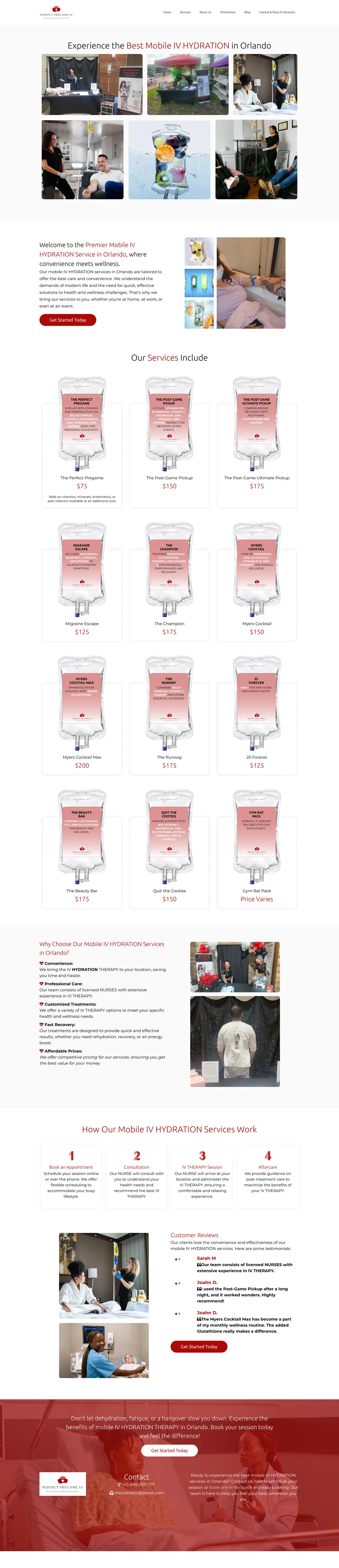
Perfect Pregame IV’s Orlando website introduces mobile hydration with treatment photography, named service packages, prices, and a four-step explanation. Repeated get-started links support its appointment-oriented service presentation for local visitors.
Three choices that shape the visitor’s experience on this page:
An image grid shows treatment and event settings before the introductory service explanation.
IV bag illustrations, package names and visible prices create a consistent service catalogue.
A four-step row covers booking, consultation, the IV session and aftercare, followed by testimonials and a final enquiry CTA.
Orlando customers needed to compare mobile IV packages, see prices and understand how a visit works before making an enquiry.
I designed the visible service website with treatment and event imagery, named packages and prices, a four-step visit explanation and repeated get-started paths.
The original website shows the service catalogue, package illustrations, prices, booking-to-aftercare sequence and contact routes. The screenshots above preserve the original page.
The case documents service presentation and enquiry design, not clinical outcomes, completed bookings or unseen backend automation.













I designed the visible service website with treatment and event imagery, named packages and prices, a four-step visit explanation and repeated get-started paths.
The original website shows the service catalogue, package illustrations, prices, booking-to-aftercare sequence and contact routes. The screenshots above preserve the original page.
The case documents service presentation and enquiry design, not clinical outcomes, completed bookings or unseen backend automation.
I’ll organise your approved packages, prices and service area into a clear mobile-care enquiry path.